Brand Expression March 09, 2019

Brand Identity in the Digital Age

It's More Important Than Ever to Use Your Brand's Logo, Fonts, and Packaging to Tell Your Brand Story and Set It Apart from the Competition.

When Steve Jobs made his triumphant return to Apple in 1997, one of his first tasks was to change the company’s logo from the multi-colored, once-bitten apple to the monochromatic, once-bitten apple that still adorns our MacBooks and iPhones today. Although the move was primarily a financial one—the colorful stripes meant higher printing costs—it also represented the company’s transformation from a manufacturer of computers to a designer of luxury consumer goods.

How valuable was this logo tweak to Apple? Would the company still have gone from being within 90 days of bankruptcy to being worth more than $1 trillion if they had stuck with the old rainbow logo?

A truly effective brand identity does something almost magical—it instantly communicates a brand’s values.

These questions are impossible to answer, but they are similar to the questions brands face every day. Do we need to refresh our brand identity? Can we afford to? Can we afford not to?

The fact is, in an era of fragmented audiences, programmatic advertising, and declining marketing budgets, a consistent and memorable brand identity is more important than ever. But brand identity goes much deeper than just a logo and a color palette. A truly effective brand identity does something almost magical—it instantly communicates a brand’s values.

What Does a Logo Express?

Back in 1971, Phil Knight was still teaching accounting at Portland State University while running a little company called Blue Ribbon Sports. For the previous seven years, Blue Ribbon Sports has been importing and selling Japanese running shoes. When the company’s relationship with Onitsuka ended, Phil Knight and his partner, the legendary Oregon track coach Bill Bowerman, were ready to launch their own brand of shoes under a new name—Nike.

As the story goes, Knight overheard an art student named Carolyn Davison say she needed some extra money, so he commissioned her to create designs for the new shoe brand—at $2 per hour. Knight gave her only one design direction: it had to look like speed.

Davidson took her inspiration from the name Nike, the Greek goddess of victory. One of the designs she presented to Knight was the now-iconic swoosh, which resembles the goddess's wings, and implies movement, flight, and the sound of an athlete speeding by a competitor.

While this may seem simple—that the swoosh stands for speed—it’s actually core to the Nike brand’s value proposition. As Knight says in an interview with the Harvard Business Review, “If we get the people at the top, we’ll get the others because they’ll know that the shoe can perform.“ Meaning, if casual joggers and YMCA basketball players see Alberto Salazar and Michael Jordan wearing Nike shoes, they will trust the product to give them a little extra speed.

At Britton Marketing & Design Group, we believe a brand’s identity—it’s mark, logo, typography, voice, and packaging—must be more than just an art project.

What Does a Font Communicate?

When you visit the website of Buffy, a new bedding startup, the first thing you notice is the font. The round and quirky take on Cooper Black was created by Natasha Jen, a partner at Pentagram. In an interview with Vox, Jen said she and the team at Buffy were inspired by the counterculture of the 1960s and 1970s, particularly the look and feel of artifacts such as the Whole Earth Catalog and the Ant Farm design group’s “Inflatocookbook", which were the ancestors of today’s wellness culture.

“Stylistically, the ’70s were really exuberant and free, and also extremely diverse,“ Jen says. Later, Jen points out, “It doesn’t seem surprising that when people [today] are trying to find something comforting, we don’t want something that feels Swiss, which can bleed into fascism.“

What does all that have to do with a bedding start-up based out of New York? Well, just listen to how the brand talks about its products: “Not all textiles are created equal. We only use sustainable and renewable versions of those materials you might already be familiar with.“ And: “Our cool-to-the-touch eucalyptus fabric is more breathable than cotton and softer than linen. Our eucalyptus is grown in Austria using 10x less water than cotton. To dye our sheets, we only use a handful of natural ingredients, like gardenia and pomegranate. Meaning no bleach or harsh chemicals here!“

It does sound a little groovy, doesn’t it? Now imagine if Buffy had used a more modern and stiff sans serif font as part of their brand identity—how would that have communicated the brand’s values of sustainability? It may seem like a small thing, but these are small details that successful brands get right.

What Does Your Packaging Say About Your Brand?

Take a moment and look at one of the dozens of YouTube videos of Casper customers unboxing their new mattresses. When the mattress brand debuted in 2014, videos like these went viral, creating a how-did-they-do-that sensation.

Of course, the ability to stuff a mattress into a box is not exactly revolutionary technology. As Paul Block, vice president of a company that sells the box-packing machine, says in a Wired article, “These roll-pack machines have been around for a long time, probably 10 years. But suddenly people found a use for them."

What no other mattress brand had thought to do was actually use the box—and the process of unboxing—as a selling point. And beyond that, no other brand included handwritten notes in the box, as well as a special tool for cutting through the plastic that encases the mattress. In short, no other brand had ever made buying and receiving a mattress feel special.

Sure, it is undeniably cool to open a Casper box and then watch the mattress expand and take shape, but that’s not the deeper brand value at work here. Instead, what Casper managed to do with their packaging strategy was make receiving a bland, unemotional commodity feel like opening a present on Christmas morning.

As Wired points out, “The focus of the Casper marketing story? Making you covet the experience of buying — analogous to how Tiffany’s Blue Box became almost as desired as the bauble inside.“
What Casper managed to do with their packaging strategy was make receiving a bland, unemotional commodity feel like opening a present on Christmas morning.

BMDG’s Legacy In Creating Values-Driven Brand Identities

At Britton Marketing & Design Group, we believe a brand’s identity—it's mark, logo, typography, voice, and packaging—must be more than just an art project. A successful brand identity should be instantly recognizable, and expressed consistently across all consumer touchpoints, and, most importantly, it must express the core values of the brand. The BMDG team is an expert at balancing those needs, as well as creating style guides to make sure the brand identity can be easily and efficiently communicated to all brand partners, both internal and external.

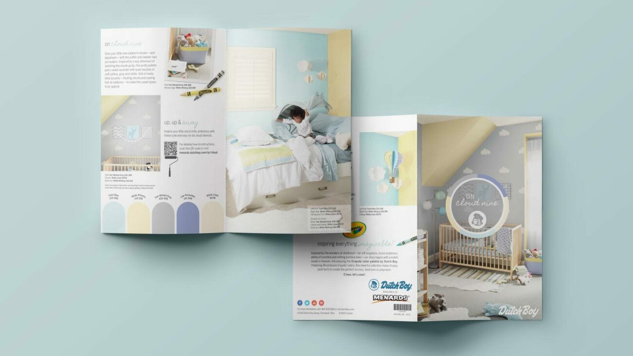
Over the years, we have helped brands such as Pyrex and Dutch Boy refine their brand identity to reach new audiences, whether that was redesigning Pyrex’s packaging system, or refreshing Dutch Boy’s logo, mark, and in-store collateral. With each client, we strived to express to consumers, old and new, what makes these brands so special.

Photos: Buffy, YouTube

What's Next?